The reason why I called my Substack space “Learning Comics and Graphic Novels” is that I truly am learning every step of the way. I enjoy the learning process.
A couple months ago, I took an online class via Kids Comics Unite on comics lettering. The speaker, Kirk Benshoff (Creative Director for First Second and 23rd Street) was wonderfully informative, and I learned a lot from the workshop.
One of the the things Kirk discussed in his workshop revolved around font sizes and spaces within speech balloons. This was EXTREMELY interesting to me – mainly because I had a COMPLETE LACK OF AWARENESS when it came to the issue.
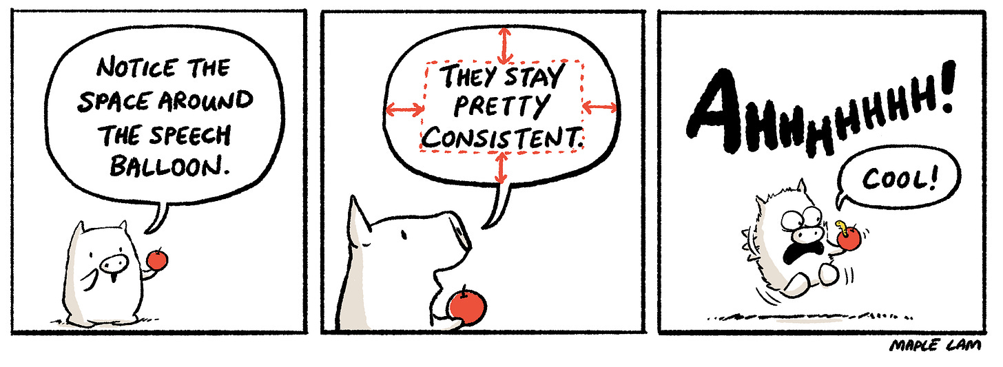
The general rule of thumb is that the text within a speech balloon should always have a relatively consistent amount of space around it.
For example…
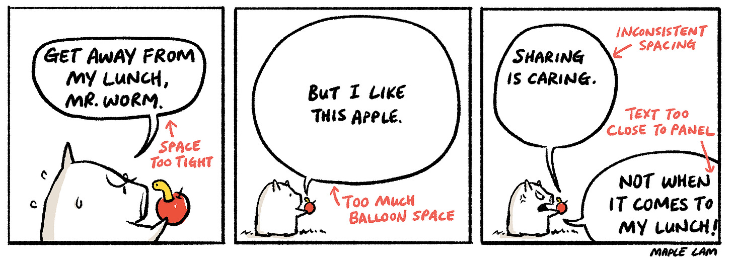
In other words, the speech balloons below are considered wrong.
When I first worked on Monkey King and the World of Myths: The Monster and the Maze, my art director pointed out that the text space around my speech balloons needed to be more consistent. I went in and fixed many of them during revisions.
My eyes were never trained for this, and I suspect it’s because I grew up reading translated manga.
Manga is written originally in Japanese, but I have only ever read the Chinese translated copies (and, at times, English-translated ones).
Layout designers for translated copies are at the disadvantage of fitting translated text into fixed-size speech balloons.
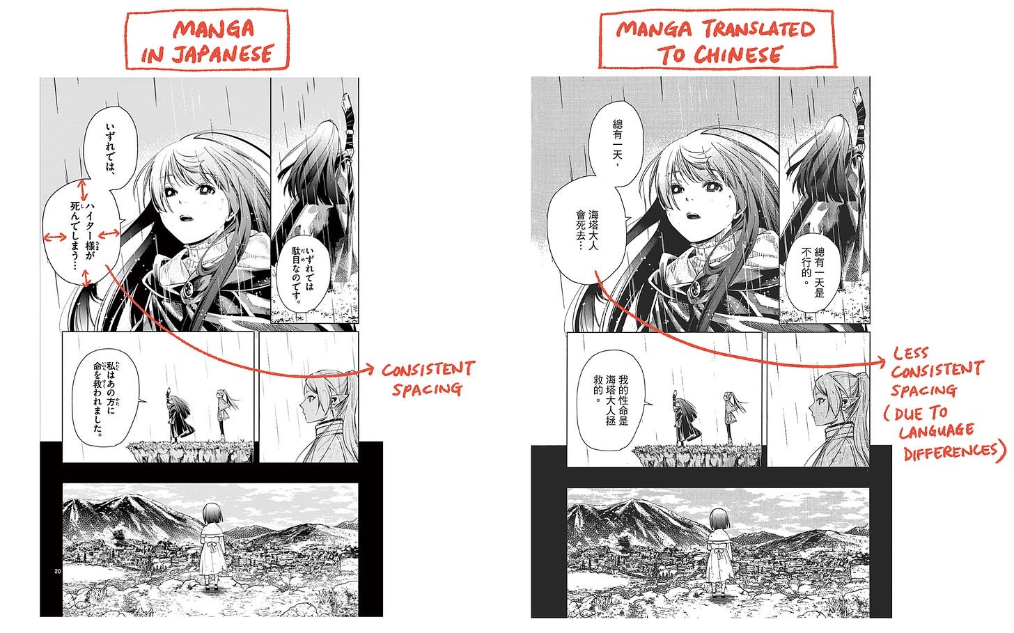
(TBH, from my observations, mangas have varied speech balloon spacing even in the original language. Part of me suspect this is due to their tight turn-around schedule and last-minute text editing. But that’s my speculation only.)
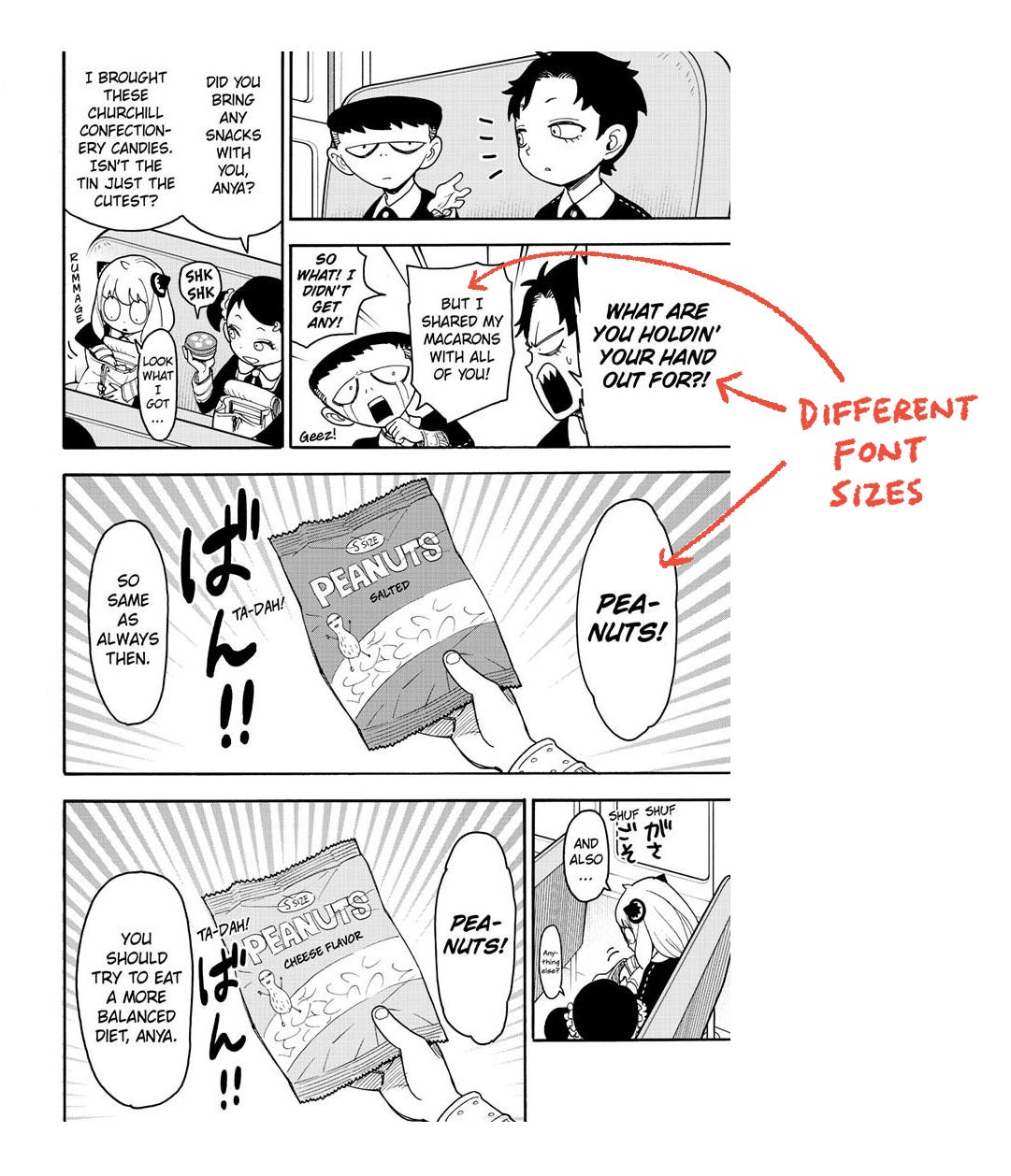
Mangas translated into English often run into the extra problem of text-orientation issues. While the original text in Japanese are set vertically, English must be read horizontally. The result becomes a lot of strangely-hyphenated text.
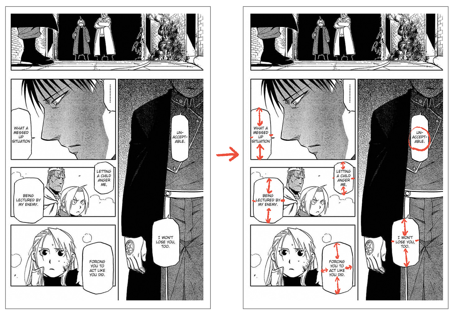
To compensate, fonts are often set in various sizes.
(Again, from my observation, Japanese text in manga are also set at various sizes. I don’t think consistent font size is a thing in the world of manga.)
Technically, there is no “wrong” in art. But there are general design rules. Sometimes, they are for aesthetic reasons; other times, for structural reasons. Of course, we can all break the rules. But it’s important to know the rules before you break them, so that when you do, there is a good reason behind it. Otherwise, it would simply look like a mistake to the trained eyes.
Just sharing some notes and thoughts when it comes to speech balloons.
Do you have rules that you break or observed to a T when it comes to creating comics and graphic novels? I would love to hear from you!


Nice. I am still trying to get this right and I've been syndicated for 17 years!
Thank you for this quick lesson on speech balloons. I really appreciate it.